Case Study: Using a UI Slider control to input alphabetical range
My role
- UX Lead
My contributions
- Desk Research
- Sketching
- UI Design

Overview
Here’s one quick and funny use case about keeping an open mind. So let’s start by me admitting that sliders are at the bottom of my list of UI elements for two main reasons: they’re not precise enough to be used on mobile devices, and they’re not accessible. For these reasons I always opted for button groups, two dropdowns, or basically anything else, just not sliders, as if they’re the Comic Sans of UI.
But life writes the best stories, and this one is about inventing a UI Slider I can be proud of.
The Problem
CampBrain hosts a lot of data, but clients still prefer hard copies, either for day-to-day operations, or for long-term archival purposes. To meet this need, an entire Reporting system was built with over 20k custom reports that access this data in the exact fashion that each client needs it to be.
However, these requests can sometimes time out given the amount of data that needs to be pulled, generated into PDFs, and sent down the wire. We’re talking thousands of pages, sometimes with photos. Even after all the DB optimizations there were times where the file itself would reach a couple of gigabytes, and would either give up on our end, or on the clients’ end when they try opening it in Acrobat.
When […] our counsellors […] review what parents have submitted, it means we are printing forms for 1,300 people. The report times out as these need to be filled by last name alphabetically […] to be able to print them that way would be helpful.
Customer feedback
User Research
Conducted Desk Research reviewing our internal DB containing client feedback and requests on the topic.
Kicked off a Design Thinking meeting with the Product Owner, covering Discovery and Define, where we established the feature scope.
Findings
Not only for
technical reasons
Yes, reports time out, but there’s also a case for this grouping like daily check-ins and filing by last name.
Last name
is enough
Our approach needs to be simple. No need to go overboard with “starts with” and “contains” logic.
One or multiple starting letters
Single letter segmentation might be too fine. Aiming for 2 or 3 groups, e.g. A-L, M-Z, or a custom range.
Personas/User Profiles
The main persona didn’t change, but their context narrowed somewhat to enable printing.
Camp Administrator
desktop user
- standard Camp Admin persona, plus
- works at the office with access to a printer
- prints reports daily
- files reports by last name
- manages camper file archive
Concepts
Managing a range using two dropdowns (“From letter” and “To letter”) was the first idea that was explored, but it became somewhat cumbersome to manage connected ranges, i.e. if I choose L in the “From letter”, this should disable letters A-K in the “To letter” drop-down list, which is easy enough. Complications arise when the user starts going back and forth trying to enable ranges in order to state their intent.
Single and multiple range selectors
The next concept introduced (fancy) radio buttons. Default value would be “all”, and the system would provide pre-configured groups of letters to narrow down the output.

Alternatively, another (fancy) checkbox array would allow for more than one group to be selected, supporting a larger number of pre-configured groups for better segmentation.

An elephant-in-the-room shaped hole
Looking up alphabetical filters I noticed that they are primarily used for index-based, contact list like filtering or jumping points.
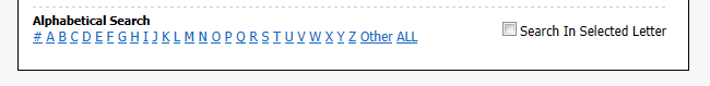
(www.healthstream.com/hlchelp/AdministratorHLCSimManager/Administrator.htm)
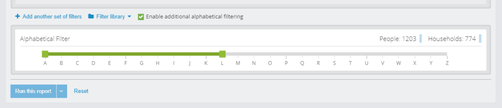
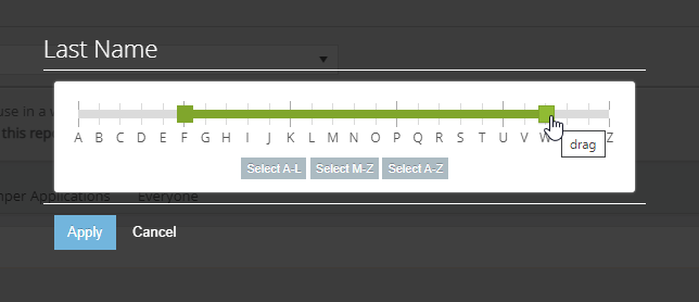
What I need though is to be able to select a range anywhere from and including A to Z. Like this, just with letters:
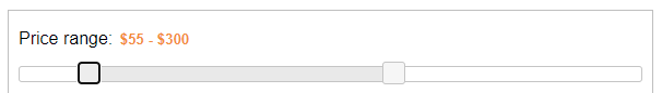
https://jqueryui.com/slider/#range
So I decided to look for an alpha range slider. And here’s comes a shocker: I couldn’t find any.
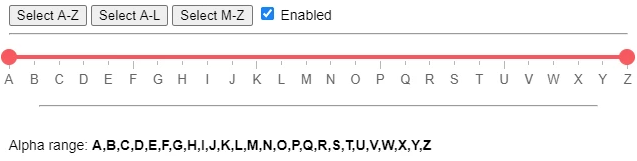
Solution
I decided to Frankenstein one together, and code the numeric-to-alpha translation table into a proof of concept. Knowing it was going to be used on a desktop, the only thing standing in my way was the accessibility, so I made sure you can drive it with a keyboard as well. Take it for a spin if you would like!
Initially this grouping wasn’t affecting the main query that produced the results. It’s was defining a subset of results, which is why it was only usable on system reports that supported this type of filter.
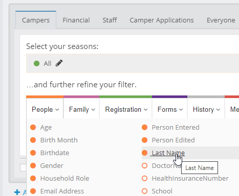
Further consultation with the Reporting department introduced a possibility of implementing this feature as a standard person-level filter, which both expanded the field of use AND reduced story points for implementation from 8 to 2.
Testing
This feature never went through usability testing with clients, but around 15 members of Product, Tech Support, Reporting, and Implementations provided positive feedback during our internal concept testing.
Impact
30%
Adoption rate
Still 10x more than the complaint rate.
-89%
Report timeouts
Number of shocked members of our team: 0
To no surprise, we saw a sharp drop (almost 90%) of report timeouts after the feature was released and announced to the clients. We also observed an uptick of saved queries that included the new “Last Name” filter; it turns out that this is an easy way to split work between multiple people.
Retrospective
Obviously, never say never.
Best practices aren’t laws; they’re guidelines to follow, unless you have a good reason not to. Also, there was a lot of prejudice in my thinking, and I needed to re-examine that, and purge my mind from all Helveticas, Comic Sans, and Slider UIs.
Keep an open mind – that’s what designers are supposed to do.
Hey, I invented something!
While I cannot claim that alpha range sliders don’t exist, I can say that I did my best to search the interwebs for one, and I came up empty. So I invented one, not by accident or research, but by combining the two input controls to match the exact need. Now I need to find a way to share it with the online community.
I should really start a Github.
#goals2022
Skipping the testing, kinda.
Smaller companies without UX testing budgets, and with one designated UX role, whether it’s part-time or full-time, will sometimes struggle with getting designs in front of their users, because nobody is pushing for it. This “UX of one” then relies on user surrogates, like experts on the team or in the company, to test those designs internally. While testing one user is 100% better than testing none, it’s not advisable to skip testing features that are field-specific.
However, guerilla testing field-agnostic features in the absence of real users can also work.