Case Study: Designing fundraising communication
My role
- UX Lead
My contributions
- User research
- Journey Mapping
- Concept Ideation and Design
- Wireframes & Interaction Design
- Prototyping
- UI Design
- Usability Testing

Overview
One of CampBrain’s larger add-ons is named Donor Module, which is an expansion of the core Camper Module and an optional Conference Center Module for managing group bookings and utilizing campgrounds year round. The majority of clients who welcomed this addition were our NPO, NGO, and faith-based clients.
It turns out that fundraising, other than the obvious financial aspect, is all about communication, and while significant challenges were tackled in the process of getting the donations into the system, the UX team focused on researching all the communication aspects of raising funds, and designing the experiences for all the flows we discover.
The Problem
Analytics like donor attrition rate, new and repeat donor retention rate, are the main data source for fundraising strategies, and we needed to understand these metrics in order to surface this data and help clients make informed decisions.
…They have been mandated to use CampBrain for their Donor functions (such as Tracking Donations) after having used [specialized fundraising software] for several years, which in her opinion is superior, rendering CampBrain to be not user friendly, very time consuming and inflexible.”
Note from our Customer Service log; a client (still on legacy desktop product) emailed to express her dissatisfaction with communication capabilities
Clients also need tools to execute on these strategies, like segmenting communication, acknowledging donors quickly, surveying them, or making some personal touches to thank them for their generosity. Needless to say, we were not privy to these processes, and even if we were, we still needed to understand the mechanics of it in the context of camps.
Another thing to mention is that the mandate was never to replace specialised software solutions like Raiser’s Edge; if clients had needs beyond basic fundraising functionality we could offer, we would always point them in that direction. So the challenge became where to draw the line – what exactly constitutes this “basic fundraising functionality”?
User Research
Desk Research, a deep dive into the subject matter to understand the space, followed by the Comparative Analysis of fundraising software solutions, including our legacy desktop product.
Reviewing relevant points from Individual Interviews our POs conducted with 40 clients, and a Focus Group with 13 clients currently using our legacy desktop product, to identify needs, themes, and camp-specific challenges.
Qualitative 5-question User Survey reaching 22 of 32 invited participants in order to help piece together invisible touchpoints on the User Journey map, identify potential pitfalls, and to get help with scoping.
Findings
There was a lot happening offline that needed some tracking, e.g. handwritten thank you notes, snail-mailed instead of emailed receipts, special treatment of VIP donors etc.
![Six presentation slides respresenting User Survey findings. Slides read:
First:
32 invited, 22 responded.
85% at want to be test users, 100% ready to provide more detail.
• What's the balance between comfort and urgency when sending receipts?
• How connected is generating receipts and sending them?
• What does it mean to send a receipt twice?
• Would you ever solicit an organization generically? • What happens when a recipient has no email on file?
Second:
One-step-shop or power to the people for sending receipts
• 1/3 was OK with a single button to generate and send the receipts
2/3 wanted either more oversight or to print and snail mail
• Streamlined process + good defaults for the first More flexibility + downloading a PDF package for the others
Third:
Generate and stop vs Generate and Go
• 75% stops to snail-mail, but a half of those • 25% emails on-the-fly as the donation is in
wish they could email
• Generating and Sending are two activities we need to bridge nicely
Recording donor mailing preference would go a long way for those with generational gaps
Fourth:
Did we send that receipt already?
• 1/3 would welcome tracking sent receipts
• A huge variety of ways how they do it now
• Generating and Sending are two activities we need to bridge nicely
• Recording donor mailing preference would go a long way for those with generational gaps
Fifth:
All your orgs are belong to us. So we spam them.
• Clients polarized into smaller "absolutely yes" to emailing organizations, and "hell, no", because real relationships matter • Even some "yes" clients would prefer DC
Feature to anger some if missing, whilst staying completely unused by a majority of users Definitely a scope call.
Sixth:
"Who doesn't have [an email] these days?!?" (client name)
• Biggest donors mostly old, hence no email
• Personal touch important, paper wins
• 100% of users default to snail-mail at the end
We need to support downloading and printing.
There's both a need for all the receipts, and only for those who don't have emails on file (or prefer paper) . Maybe it's time for "Unreachable" filters?](https://portfolio.theuxguy.ca/wp-content/uploads/BulkMailer.pptx-PowerPoint-1024x546.png)
Certain actions weren’t linear or scheduled, like receipting that can happen at any point, whether it’s cumulative (for all donations in a specific time period) or individual. However, a few clear themes emerged.
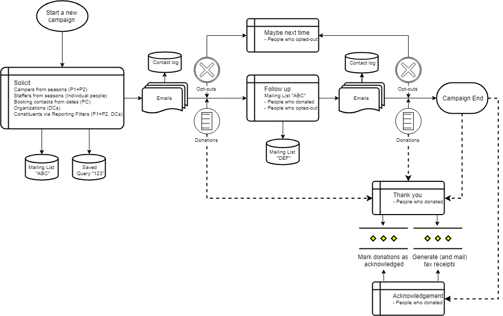
Soliciting for a campaign
Composing an email to constituents*, either limited by filters or enhanced grouping.
Following up with that exact group, or a subset of that same group, at a later point in time.
*) Constituent is a household or an organization that may or may not have donated in the past
Sending
tax receipts
Reaching out to donors, or a subset of donors.
Emailing donors their tax receipts, and marking those sent.
Printing tax receipts to snail-mail them to all donors, or just those without an email, and marking those sent.
Acknowledging donations
Reaching out to donors, or a subset of donors.
Allowing receipted donations to be marked as acknowledged at multiple points along the way.
Personas/User Profiles
Jobs that need doing constituted either full-time or part-time engagement, which is where the two Personas came from.
Camp Fundraiser
full-time user
- running multiple campaigns for different funds and target audiences
- interested in online donations, events, and gifts-in-kind
- keeps multiple mailing lists for solicitation
- needs detailed analytics and flexible target segmentation
- acknowledges both electronically and IRL, for which they need tracking
Camp Administrator
part-time user
- setting up 1-2 campaigns a year
- focused on online donations
- no direct solicitation
- wants receipts to go out automatically
- sends acknowledgements at the year end
Concepts
I put every available resource from my team on this task, since there was a lot of data to sift through, and we needed to start thinking and booking user tests once we had something to show.
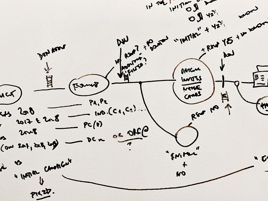
Frameworking
Before we start thinking concepts and screens, I prefer using UML diagrams to visualize end-to-end task flows, and to discuss them with Product and the Architect for approval.
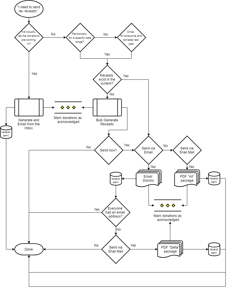
Next, each flow is exploded into more moving parts, and presented in higher fidelity. Once greenlighted, we can start thinking screen flows and UI designs.
Ideation
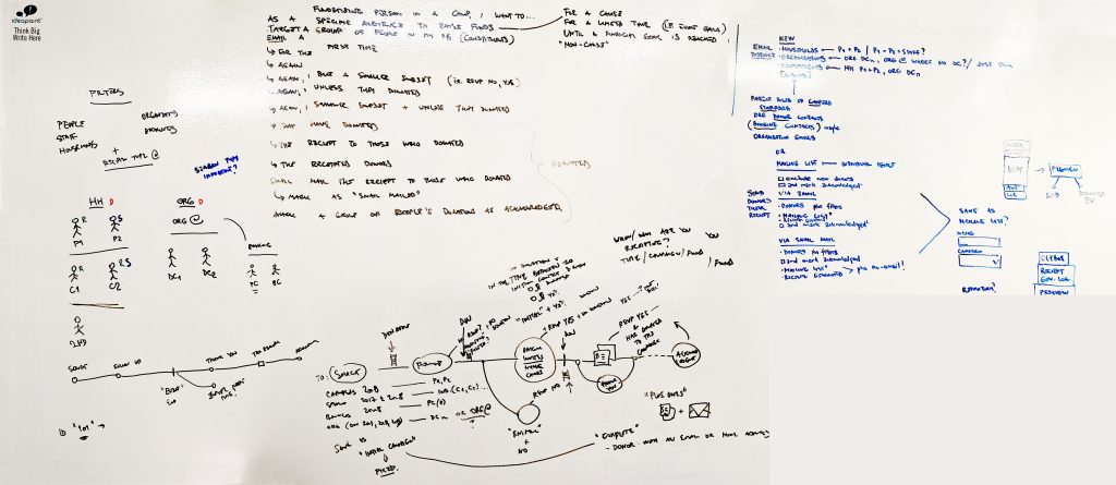
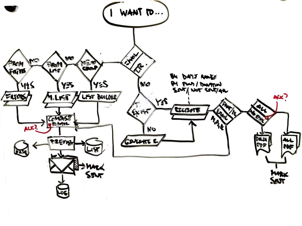
The first stab at figuring out how to incorporate all three flows started with an ideation session, after which the first concept was born. However, adding more fidelity to the design revealed that the approach wasn’t ideal.
This first approach named “Choose your adventure” was (needlessly) centralized the decision-making process for the user, so it was back to the drawing board.
The second take attempted to dedicate the entire screen real estate to the three flows individually, still accessible from the same screen via three riders… Of the Apocalypse, as it turns out. Discoverability was lacking, and whichever tab was displayed first would imply higher frequency of use or higher importance, when all three are equally important.
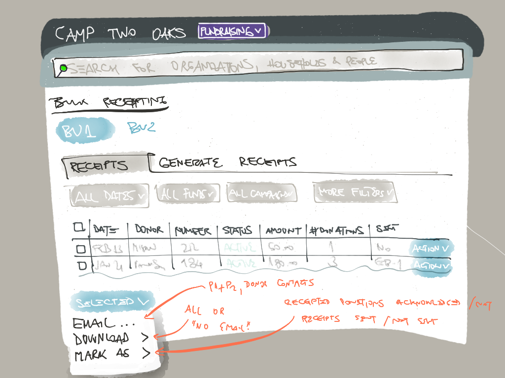
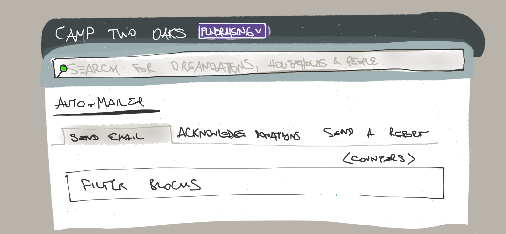
Pieces started falling into place once flows started getting treated as separate screens. Bulk Receipting rendered a list of existing tax receipts where the user can take individual and bulk actions, and when it was time to issue new receipts there was a dedicated tab for this periodical action.
Next was the Donation Acknowledging, which could be a complementary screen to the Receipts one, where Donations were listed with all their details. Once we realized how many functions this would allow, again individual and bulk, we decided to promote it to the Dashboard as the first thing users would see when accessing the Fundraising module.
Gamification of the most complex piece
The only remaining flow was Solicitation emails: contacting a mix of different subsets of constituents, e.g. “Parents of this and last year’s campers PLUS This and last year’s staff MINUS Everyone who already donated in the past 6 months MINUS Everyone who already got my last week’s email PLUS Myself and another colleague to make sure I have a copy of the mailing in my inbox”.
All this adding and subtracting in proper sequence immediately became everyone’s biggest concern; how on Earth can we make this intuitive?
Around this time Nintendo started advertising “Snipperclips”, a multiplayer co-op game where a challenging shape is given to players who need replicate it using their paper figures and their ability to rotate, move, and clip each other.
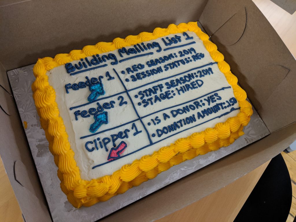
In my mind defining a mailing list was like defining that arrow. I knew this was exactly what we needed to recreate in our list manager; enter aptly named “Feeders” and “Clippers”, terms that nobody in the company managed to replace with better ones, so we launched with those!
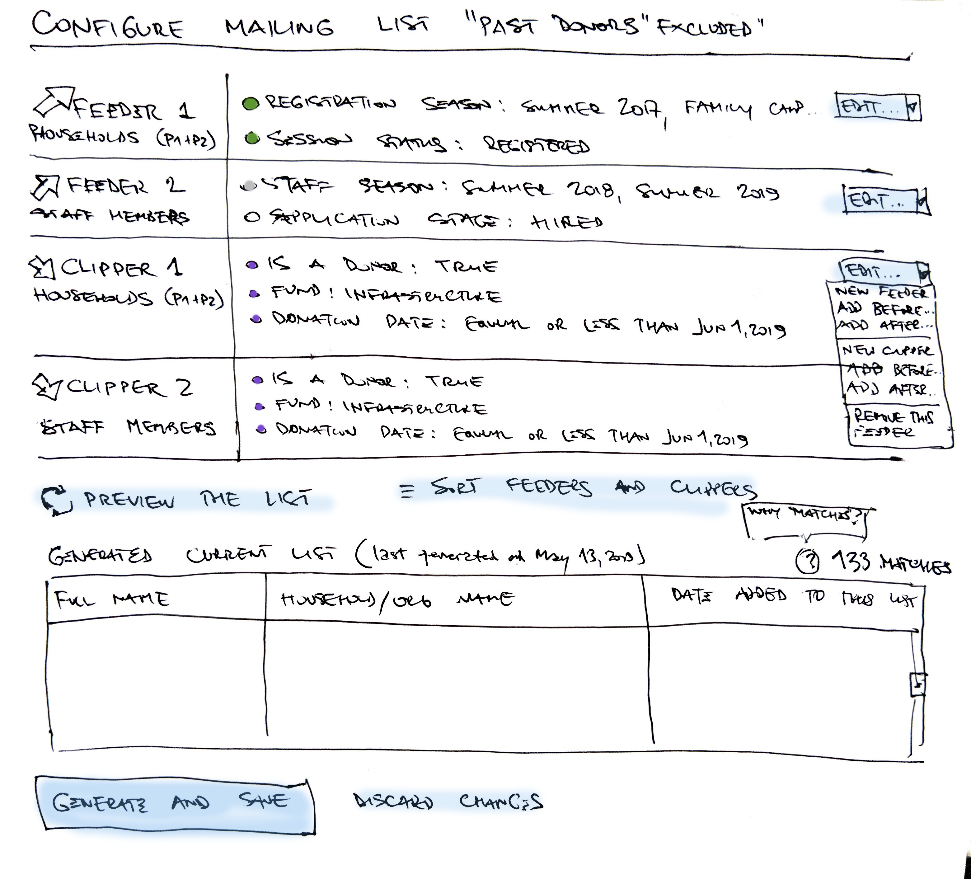
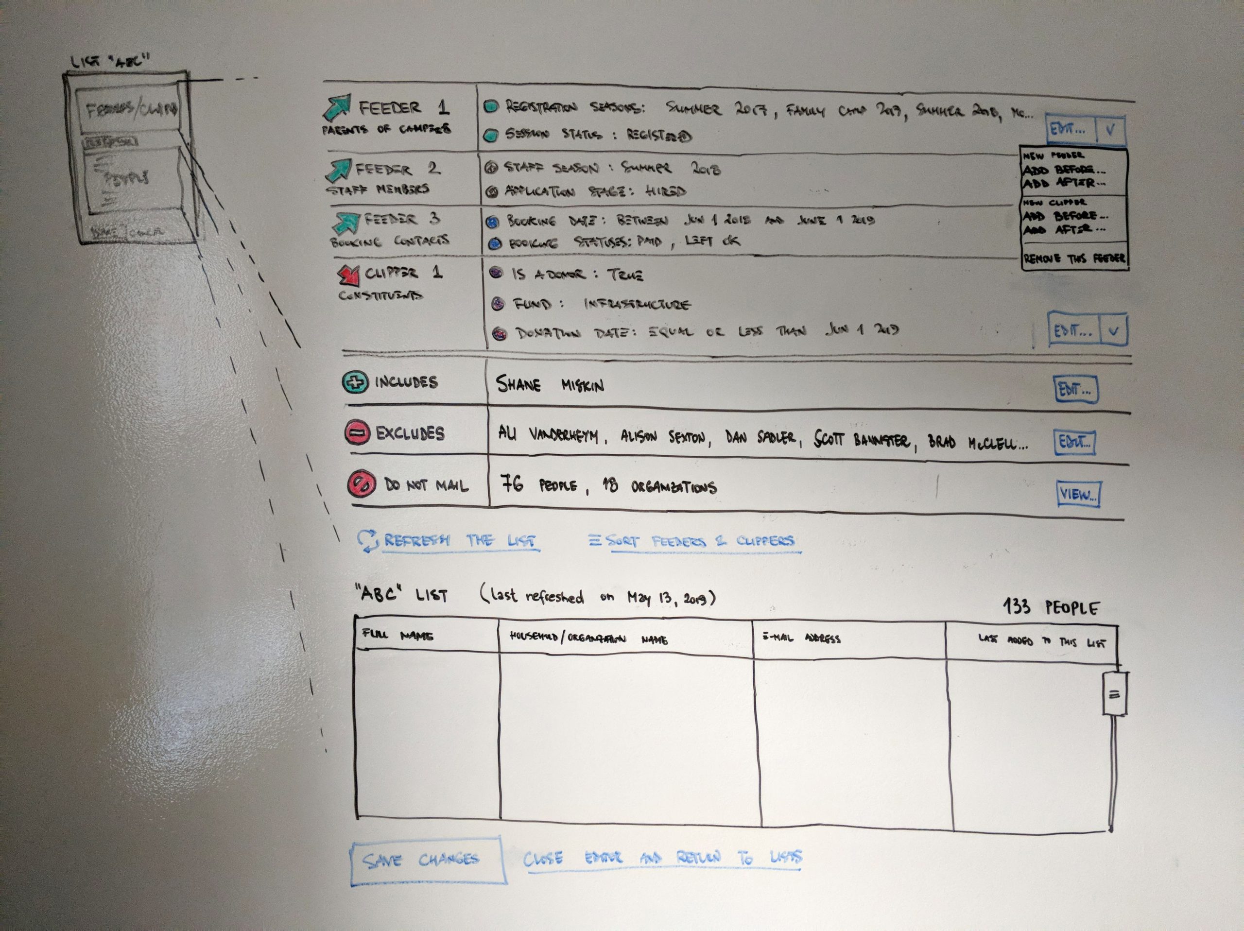
Create your mailing list using feeders and clippers. Both feeders and clippers use filters to determine which individuals to add or remove from your mailing list. Feeders add people to your mailing list while clippers remove people.
Instructions copy from the UI
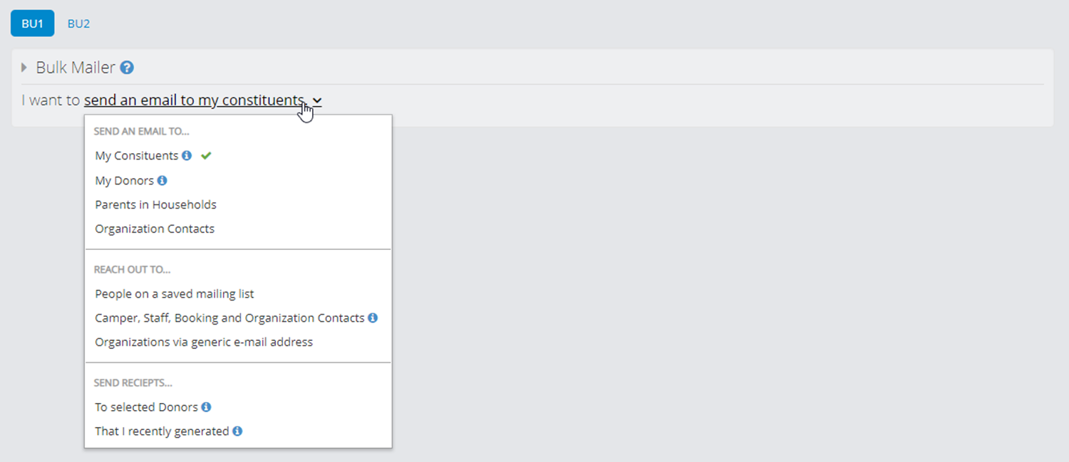
Instead of building a whole new Emailing screen, we decided to repurpose our existing one, but instead of entering recipients manually, users choose a named configured mailing list instead. Recognition over recall 💯
Solution
This one felt great all around. Product and UX were super excited with functionality provided, engineers were able to work in parallel and not step on each other’s toes, and Story Point estimate came under the budget.
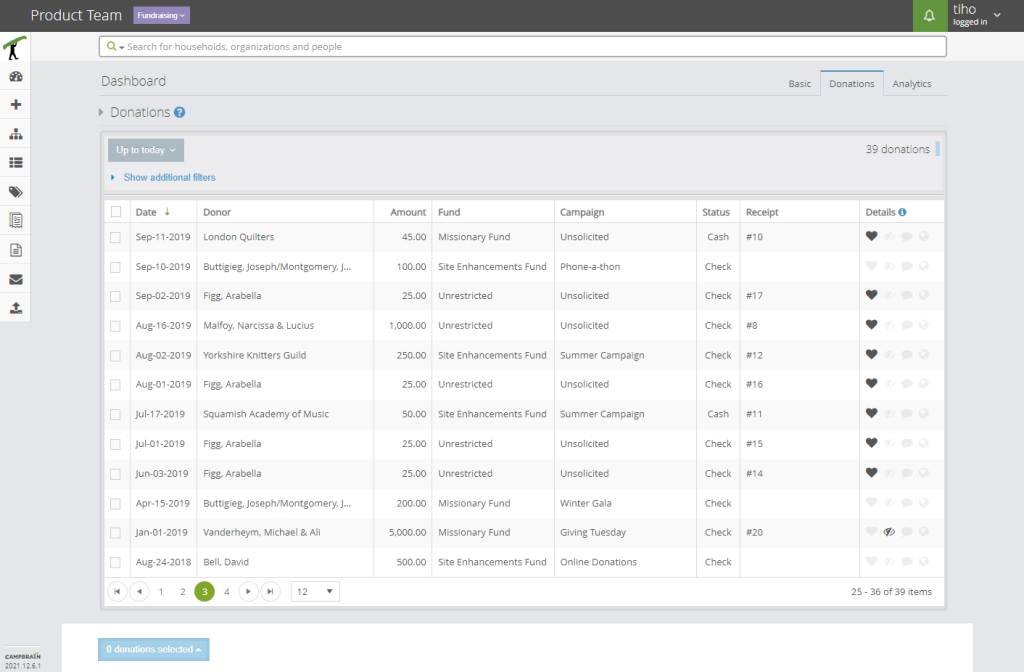
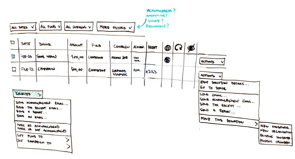
Acknowledging Donations
List of donations limited by date range filters, showing all necessary details.
Heart stands for Acknowledged status.
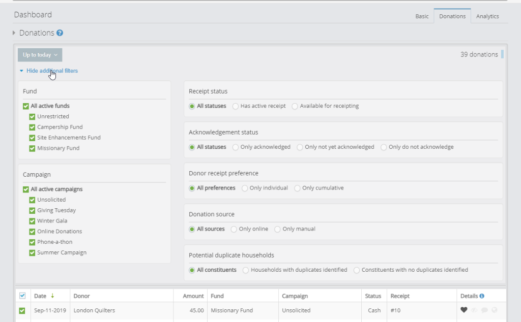
Given different use cases, the system offers filtering capability to narrow down the list of donations. These are stored and remembered per user.
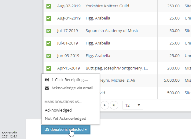
Selecting a few or all donations gives the user a few options, such as marking them as Acknowledged or not, selecting recipients to receive a Thank You email.
Later improvement added a “1-Click Receipting” for a full automated experience; selected donations will get tax receipts created, and attached as PDF to an email with a Thank You body text, and the donations can even be marked as acknowledged in this process.
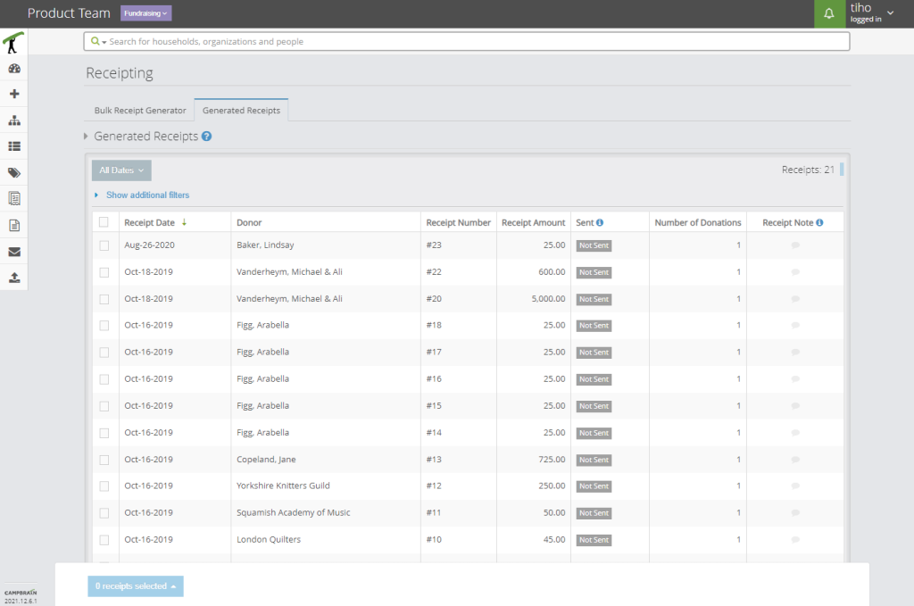
Sending Tax Receipts
List of tax receipts limited by date range filters, showing all necessary details.
Additional filtering by receipt properties is possible here as well.
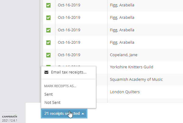
Selecting a few or all tax receipts gives the user a few options, such as marking them as Sent or not, and selecting recipients to receive a tax receipt attached in an email.
Emailed receipts are automatically set to “sent”, but if the user snail-mailed them, they can mark one or more as sent from here.
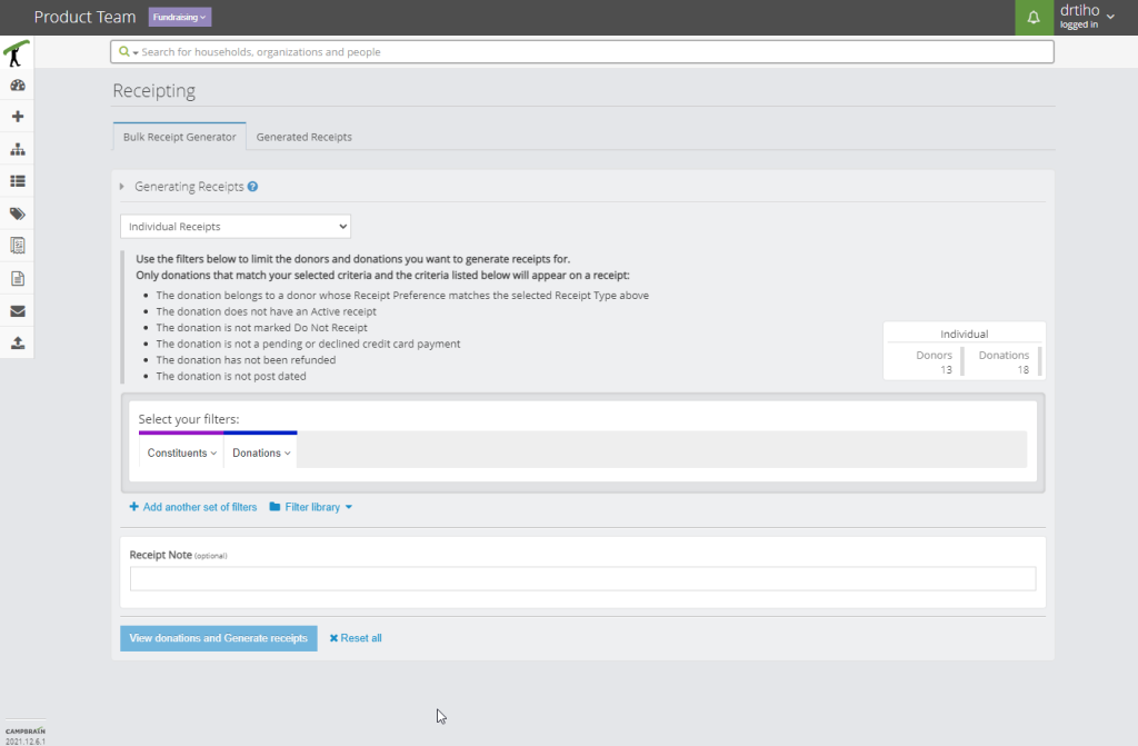
Manual receipt generation is one click away in the neighbouring tab.
The user can further narrow down which donations to generate receipts for, confirm the list in detail, and run the generation job.
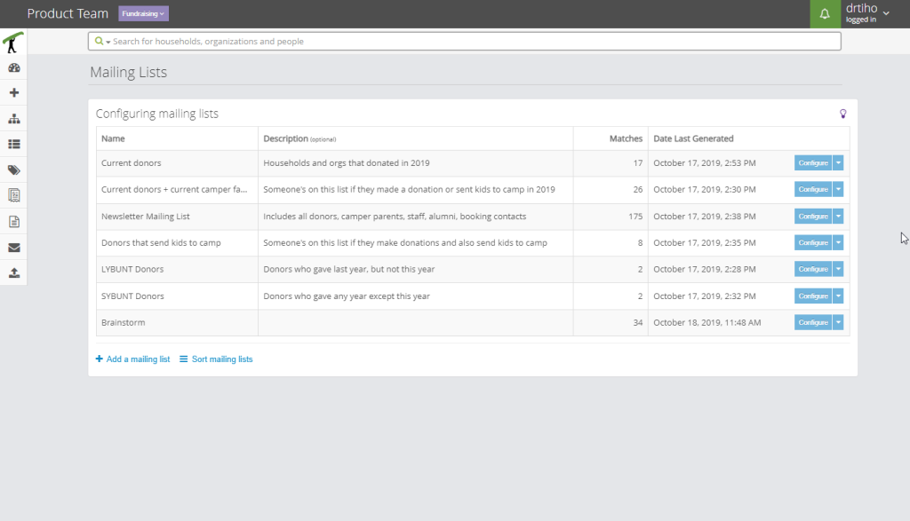
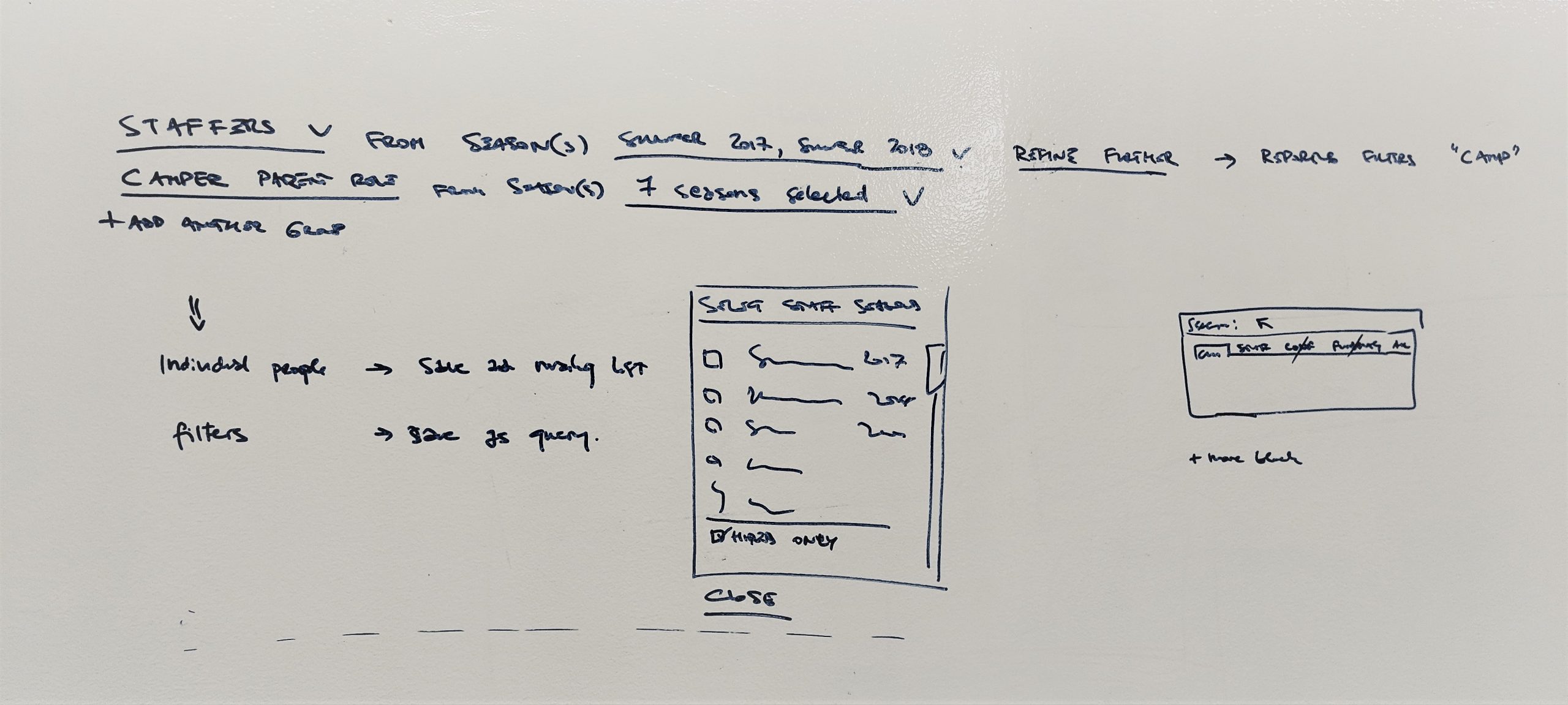
Soliciting for a Campaign
List of configured mailing lists, showing all necessary details.
One key factor is that lists are permanent; new people might enter the database, and existing people may qualify to be on the list, but nothing happens automatically. Regenerating a list is a deliberate action.
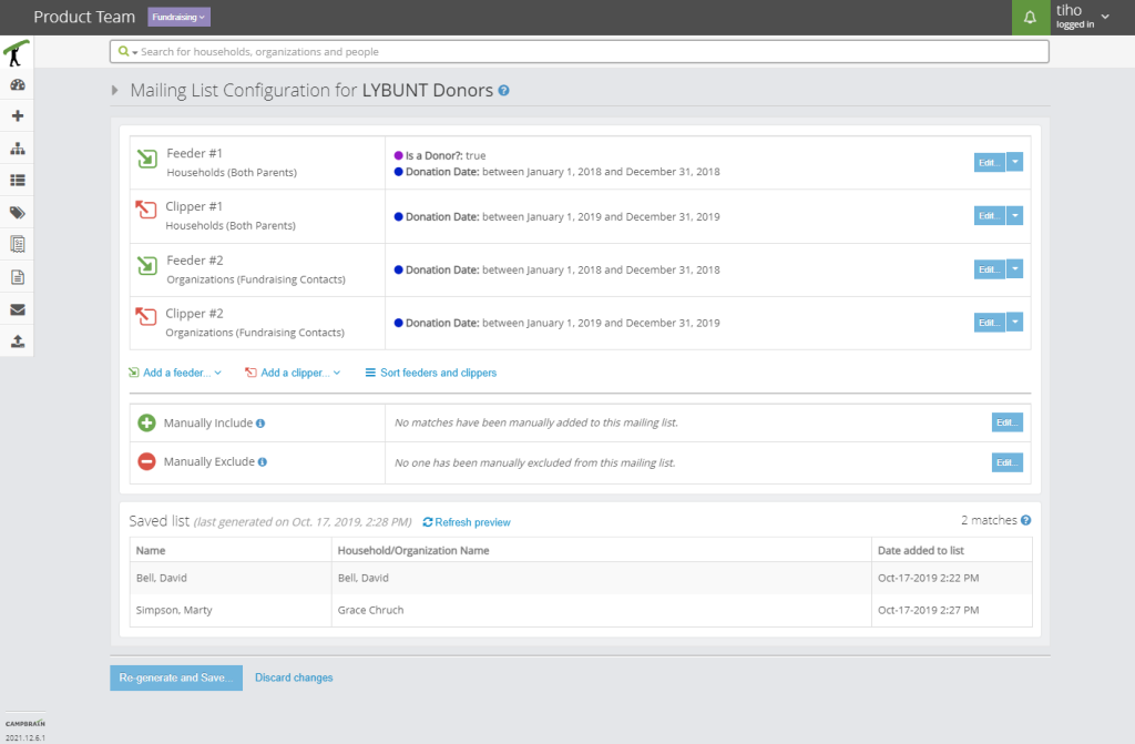
An example list with two Feeders and two Clippers. Each block features a “recipe” which individuals will be added and removed, and in which order.
The generated list is present in its entirety. If refreshed, it will preview what it would look like if user chose to regenerate it, as per applied Feeders and Clippers, but it’s not affecting the actual list.
Manual blocks allow for individuals in the system to be looked up and always included or excluded, regardless of the Feeders and Clippers.
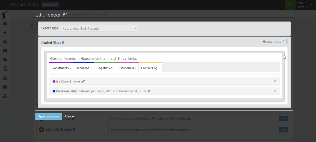
Adding or editing an existing Feeder or Clipper happens in a modal screen. These limit queries presented as reporting filters are very familiar to the users.
Any change will update the count of affected constituents.
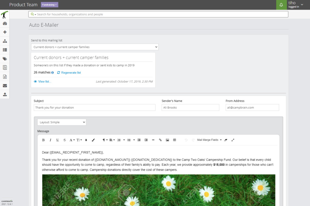
Our standard Email Composer was retrofitted with a mailing list selector in place of recipient “To:” field.
To cut down on navigating to the mailing list configuration, we added previewing a list from here, as well as an option to re-generate it on the fly before sending.
Testing
- engaged 18 of 22 clients from user survey in two separate occasions for concept testing
- conducted 90-minute moderated remote usability tests with 8 representative clients
Impact
Over 200 clients have subscribed to the Fundraising Module, and we’ve been overwhelmed with positive feedback. While I don’t feel comfortable disclosing the sum total amount of donations that came in, I can share a few numbers that pertain to the communication aspects. Big thanks to the DevOps crew for these.
1.4M
Emails sent
Think of the trees we saved.
24.9K
Receipts generated
Our apologies to CRA and IRS.
8,122
Feeders & Clippers
I wonder which shape those would be.
However, I need to be selfish here and mention the biggest impact I personally felt from designing this feature. What you see on this photo is a cake that Ali, our lead Product Owner, baked and decorated to honour and celebrate the concept of Feeders and Clippers. This is the CampBrain way, people.
Retrospective
You won’t get it the first time around.
Designers have a tendency to be very stubborn, and tie themselves to the first concept that looks good. One of my design teachers told us about this ‘idea generator’ that we freeze as soon as we think we solved everything.
Fail often, fail quick. Let go.
Inspiration is everywhere.
I cannot not call it luck, the timing of the “Snipperclips” promos and my biggest challenge profiting from it. But even if I hadn’t been that lucky I would have looked elsewhere, anywhere but at the blank page. They say only when you are in a pleasant state of experience do your body and brain work at their best.
Thinking joyfully and in a calm state of mind works better than thinking hard.
Ask for directions.
Like, at every turn.
Working on an in-house SaaS you get used to knowing the subject, and knowing the user. This time around I knew that I know neither, but knowing that you don’t know is a very useful and humbling experience. More than ever before I had to pull from all resources to get a good picture, and start producing relevant material.
A series of frequent, but quick feedback will keep you on the right path.