
How Dark Patterns Creep Me Out
It’s tax time, but my favourite tax return company SimpleTax got bought by WealthSimple, so I decided to give it a shot this year, since they already have all my data from previous years. If you want to check it out, look for “Wealthsimple Tax” and observe the “always free tax filing” ad or link.
My first thought was “always free”, which was about to be a deviation from my regular $30-40 donation. I also know a few people that invest with Wealthsimple, so I assumed this was their take on a Tupperware party; a proverbial free steak dinner to hear about this amazing timeshare opportunity.
I’ll give them easy, accurate and hassle-free! It took me 5 minutes to link all the services, and add non-default sections and docs to my file, and submit. 🛫
🤚🛑🚫⛔
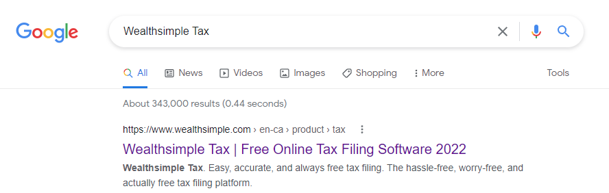
But then my submission and I were taken into this room.
OK. Not free after all, since I don’t see a “No, thanks” option.
Wait, let me think like a programmer! (said no one ever)
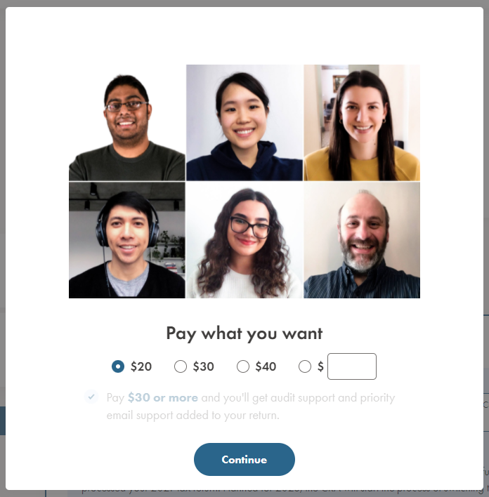
Custom amount. Zero. Boom!
Woah! I can’t continue anymore? The button is disabled!
“To help us improve…”?
More like “To release you, could you please…”, with an undertone of “Since you’re not helping these wonderful people pay rent, mortgages, and put food on their (kids’) table, could you please…”
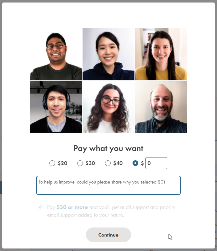
OK, let’s see if we can enable that Continue button with some feedback, and six Hail Marys for all the guilt I’m feeling right now.
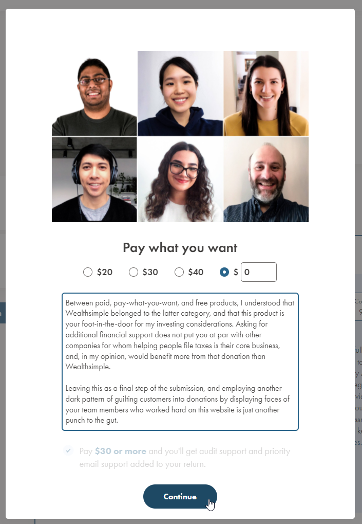
Between paid, pay-what-you-want, and free products, I understood that Wealthsimple belonged to the latter category, and that this product is your foot-in-the-door for my investing considerations. Asking for additional financial support does not put you at par with other companies for whom helping people file taxes is their core business, and, in my opinion, would benefit more from that donation than Wealthsimple.
Leaving this as a final step of the submission, and employing another dark pattern of guilting customers into donations by displaying faces of your team members who worked hard on this website is just another punch to the gut.
— Satisfied customer, whose personal and financial data you can freely dig through, generate your own meta about, and sell it to the marketers
To provide some context to that first paragraph for non-Canadians, Wealthsimple is a $5B CAD company.
Don’t use dark patterns, people.
Thinking of this topic I can’t recommend a better read than a fellow UX designer’s Jonathan Shariat‘s book called Tragic Design.
Bad design is everywhere, and its cost is much higher than we think. In this thought-provoking book, authors Jonathan Shariat and Cynthia Savard Saucier explain how poorly designed products can anger, sadden, exclude, and even kill people who use them. The designers responsible certainly didn’t intend harm, so what can you do to avoid making similar mistakes?
It’s about Value and Impact
Here’s hypothetical me working at Wealthsimple and receiving that feedback above. What can we do better?
Get Product, Business Development, and Marketing in a room to discuss SWOT on this pricing strategy to determine if it’s damaging our brand:
- How strong of a revenue stream is this new Tax branch of business, and how reliable is it in the long run in this Red Ocean of tax-return products?
- Do we risk alienating new or (God forbid) existing customers with this model, effectively lowering LTV in order to score $30/anno?
- Are we missing an opportunity to convert the Tax branch as a pipeline to new customers, positioning it as the only “truly free” free professional product, providing it with an obvious USP?
In case that Business comes back and says “yeah, we shook that tree, we still want to charge for it”, then the ball is in the UX court.
- Get a crystal clear picture of how people are engaging with this screen:
- Sign up for FullStory or similar, and get a good sample. You can’t hear or see the people, but measuring time-on-task and their path to completion will help you gauge the sentiment.
- Define Personas for “Zero Dollar Customers” and “Paying Customers” to better map their experiences, and design user tests later.
- Add additional Personas or segment existing ones further to identify if they are High Value customers, or “New Business – Tax Only”.
- Run A/B Tests with a UI that has a pre-configured $0 “No thanks” option, to observe potential uptick of “Zero Dollar Customers”, which might indicate existence of one or many dark patterns.
- Build a Journey Map for each Persona, track touchpoints and identify emotions along the way.
- Synthesize research into a report that should highlight problem areas in UX, and whether this hinted at CX implications.
- Run an ideation session to address the dark patterns, and create another A/B to record changes in behaviour.
Having numbers to support your redesign will help you speak the same language as the business folks. Providing an alternative you A/B tested will help you sell the positive UX change.
Mental Note: Write about the overall need for tax return companies and services in general, and how governments should have their own public facing interfaces instead.

Featured image: Background vector created by kjpargeter - www.freepik.com